


New FMC logo!
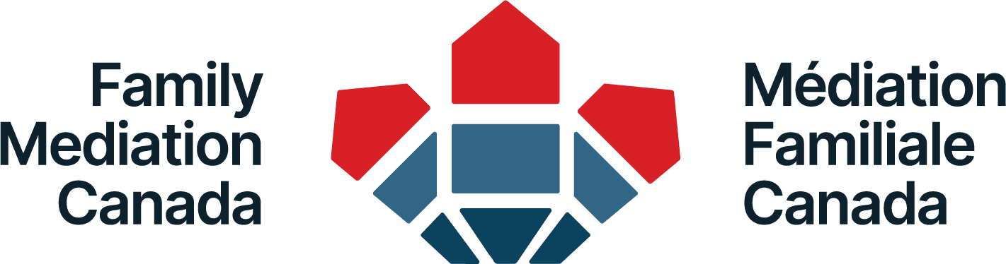
We are excited to share Family Mediation Canada’s refreshed visual identity. Our new logo builds on the spirit of our previous overlapping houses while offering a more modern, versatile, and distinctly Canadian symbol.
The red houses represent the many forms of family and the multiple households often involved in mediation. The blue foundation conveys stability and structure, while the white line creates a bridge between the houses — a symbol of safe passage through times of transition and the mediator’s role in guiding families toward clarity, connection, and resolution. Finally, the overall silhouette echoes a stylized maple leaf, strengthening FMC’s national presence.
We are proud to share a logo that honours FMC’s past and reflects the professionalism, inclusivity, and leadership that define our work today.